2014’s Top Ten Film Posters (according to us)
So here we have it — All the major films due out this year have been released (besides the third and final Hobbit, but let’s not talk about that…), and while a vast majority of releases had the usual floating-head collage with boring type — including a few Trajan’s in the mix as usual — and more often than not a blue/orange gradient map or filter.
THRILLING, no?
As with any year, however, there are a few stand-out candidates that have lovely happy-to-hang-on-your-wall poster advertisements. Please bear in mind this in no way means the film itself is good or even watchable, and nor does it mean we like or endorse said cinematic foray. What is DOES mean is that the poster design is well designed, attractive, or otherwise interesting. This list is in no particular order, so Let’s have at it!

The Drop
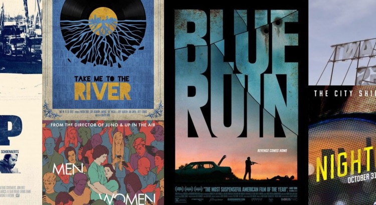
An interesting throwback to 1970s washed out monotone poster. The typography is crisp and clean and the addition of a subtle texture adds to the feel. The muted tones and washed-out colour look great, especially with the loss of detail amidst the darker areas. Composition-wise, it feels solid. While not ostentatious, it’s a keeper.

Men, Women and Children
Never heard of this movie, but what a great poster. Lovely use of garish colours in interesting ways. The blocks of colour go well with the illustrative style, focussing on the plainly coloured couple lost in the middle of a vibrant but despondent crowd. And that type, my god. Simple but superb placement!

The Book of Life
Not to be mistaken for the grandiose Tree of Life, it’s an animation featuring heavy influence from Mexican/Latin American mythos such as Día de Muertos. The art style in the film is rather beautiful in itself, but this poster exudes style — The iconic style of mask, oldschool type treatment and a really stylish layout. Very eye-catching and gorgeously rendered illustrative poster.

Take Me to the River
Reminiscent of posters of the time, all hand-drawn art with bold, rich colours. A neat metaphor used with attractive realisation. Subtle type in the background and a sumptuous, dominant illustration really go well together. The lack of counters in the title looks great — a rarity. The ticket stub is a nice touch too.

Blue Ruin
As gritty and dark as the film itself. It’s fairly rare for films these days to focus on the title as type, but the fractures and rusty, bullet-ridden texture work so well. The bold, broken glyphs loom over a grim set of silhouettes and the titular blue ruin (that’s the car). It’s not often that a film poster reveals such tension or displays itself in such a stark manner, but Blue Ruin hits it out of the park. I’d gladly have a full-size version of this hanging in the studio.

Big Significant Things
Wow. We’d never heard of this film, but what a cool poster. Such a jarring contrast to usual posters, leaving the canvas completely empty (well, aside from wispy cloud formations) allows focus on the equally minimalist type. The title as an advertisement or motel sign (or similar American roadside iconography) is a great metaphor, strengthened by it being the reverse of the sign — implication of movement, looking back, driving past, leaving things behind. Plus, it certainly makes it engaging, trying to read it for the first time.

The Editor
Is it the 1950s again? What a great poster! Full of energy, vibrant acid colours, dramatic and expressive faces and really intricate illustrations. Somewhat reminiscent of Hammer Horror’s back catalogue. It certainly stands out, especially amid the contemporary styles with muted colours and clean layouts. A mass of precision chaos. Love it, and love the way the title type has been handled.

The Maze Runner
Most of the posters for this film are the usual shtick, though two in particular stood out. One was simply the maze with the title as part of it. Nothing special, but executed very well. This, however, echoed back to Saul Bass’ aesthetic and was quite beautifully done. The disparity between the usual types of posters expected for this kind of film is refreshing, but it’s the flawless technique here that makes it even more worthwhile. Much like Ocean’s Eleven and the sequels, it takes Saul’s legacy and makes good on it. The texture works really well, the type is solid, and the arrangement and composition is excellent. The bold orange, white and black palette is spot on, letting the empty space run wild in the orange and making the white, a typical choice for empty (white) space the enclosing, heavy object.

The LEGO Movie
A huge film this year, and quite a landmark for toy history I suppose. Nonetheless this poster, while busy, is incredibly cool — much like the film it has all the colour, character and creativity that LEGO brings. The premise of building is front and centre, but not in the traditional LEGO concept of hands clicking bits together, but the hard-working LEGO men and women that make the LEGO world. It is a joy to look at, genuinely heartwarming.

Nightcrawler
While this list isn’t in any order and is not a ranking system, this is my personal (Josh of Webber Design!) favourite of the year. So moody and intriguing. The halftone pattern hints of pulp magazines, shlock-style publications with unscrupulous folk making it. It’s dirty looking. The up-close shot of Gyllenhaal reminds of Christian Bales’ Bateman in American Psycho. The dying light of the city reflecting in the aviators. The focussed, but hollow expression reeks of madness and obsession. The warm colours set the scene. Lovely. The typography is awesome too — simple, but effective – the angled sick-yellow font with worn-looking rounded corners sprawled across the skyline and the wide inter-character spacing with high x-height just exudes sleaze.