www.webber-photo.com
This month we relaunched our sister site: Webber Photo! Webber Design’s MD, Rhys Webber, may be a widely-skilled man with decades of both print and web design skills, but his first love is photography. He shoots all sorts, from people, to landscapes, to abstract. He also offers his services to businesses for corporate photography and product photography all over Wales and parts of England.
As a photographer, the primary thing that prospective clients and industry associates need to see is…Photography! Unfortunately, it seems a lot of photography sites seem to forget that and end up bogging down the site with assorted unnecessary design elements. Let the pictures do the talking — Some say they are worth a thousand words!
What we did:
— Full preliminary design mockups in Adobe Illustrator
— Completely hand-coded fully responsive HTML/CSS/jQuery website
— Bespoke responsive jQuery slideshow functionality
— Implemented on our preferred Content Management System (CMS)
— Maximised Search Engine Optimisation (SEO)
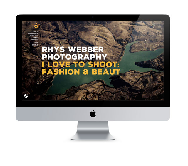
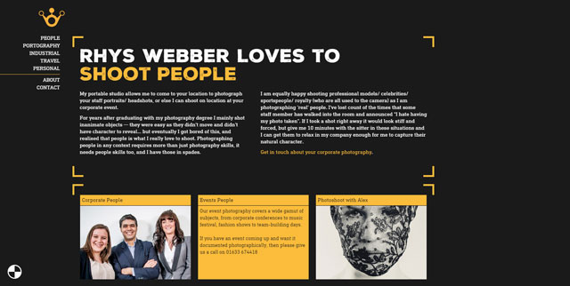
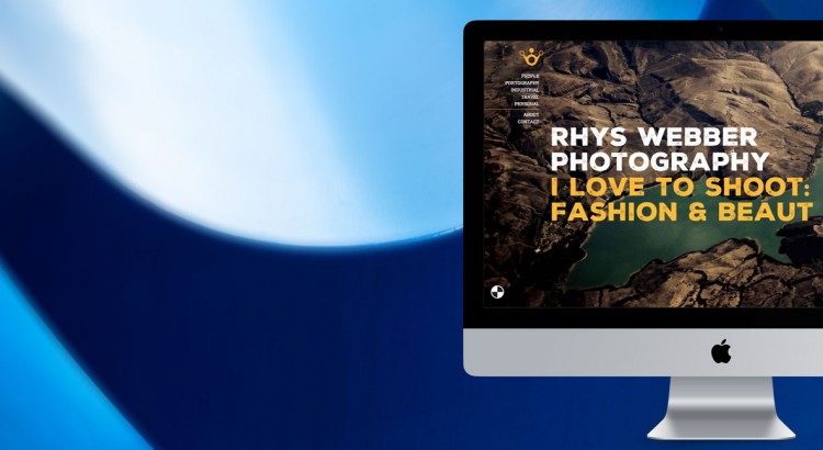
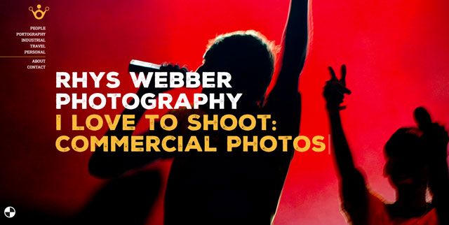
As the “client” (Rhys) shoots a great variety of things, we decided the best course of action was to segregate them appropriately right off the bat rather than have a “portfolio” page that has sections within. We put the contact details/submission form and the “about” section on the homepage to get it available straight away and allow users to jump right in to the images after that. Beyond that, our reasoning for splitting it right away is because most viewers who come to photography portfolios are looking for particular types of images, such as a business looking for corporate photography, or a model looking for fashion photography.
We made a lightweight landing page for each section that gives an overview and links into the individual galleries. This removes the clutter of massive grids of tiny thumbnails where you can’t really appreciate or organise properly. This way, we avoid loading unnecessary images until the user decides on a gallery which speeds up loading times, reduces stress on internet connections especially for those with slow connections or are using mobiles/3G/4G.
Now onto the meat of the site: The photos! Our primary coder, James, wrote a completely custom one-of-a-kind jQuery slideshow function that kept things quick and smooth and allowed us to have full control over our images and content. Plus we added a lovely SVG loading animation. Woo!
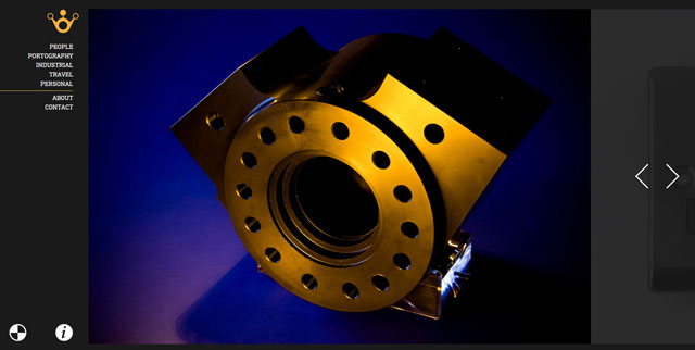
Rather than show a myriad of thumbnails and lightbox the photographs (i.e.: display one floating image), we wanted to show each image big, bold and beautiful, one at a time. Pressing the arrows moves you through, but we also added use of the arrow keys on keyboards and the swipe function for tablets and mobiles for improved user experience (UX). We wanted it to be as simple as possible — As Steve Krug always said, “don’t make me think!”.
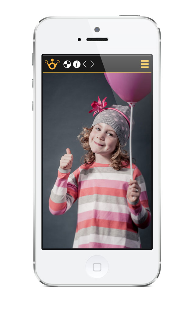
Of course, there was a minor issue. All photographs are different, with some dark and some light. We thought ahead of that issue and added a great functionality: On-the-fly CSS switching! For those who don’t know, CSS (Cascading Style Sheets) is what makes the web pretty. It’s the code that defines non-content properties, such as size, shape and colour all over the internet. We made it so that at one click of a button users can swap between a dark theme and a light theme WITHOUT reloading the page, and the theme choice carries on throughout the whole site and is able to be switched with one press at any time! Try it out — it’s pretty satisfying.


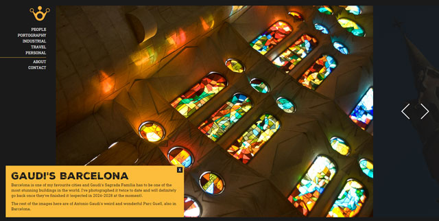
Lastly (but not quite least), we didn’t want text to get in the way of the images or require hunting for, so we added a small “i” information icon to bring up a brief description of the gallery the user is currently viewing.
What do you think of the result? Check it out!
A very insightful post and one that a lot of new and upcoming web designers will find useful in the future. I like many of the design choices you made, especially where ‘lightweight pages’ were concerned.
Much appreciated! Sorry for the late response — Been exceptionally busy in the studio.
I hope designers-in-training find this kind of post useful. If there’s anything you (or anyone else) would like us to elaborate on, just ask and we’ll work it into our next one!