Branding design for Yummy Italy
The first step for us when asked to develop a new brand, was to audit the existing one. Where possible we suggest that clients tweak rather than redesign if their brand is already established, following the old adage "Don't throw the baby out with the bathwater". However, this time we suggested to the client that a complete redesign would be the best option for the brand, and the client agreed.
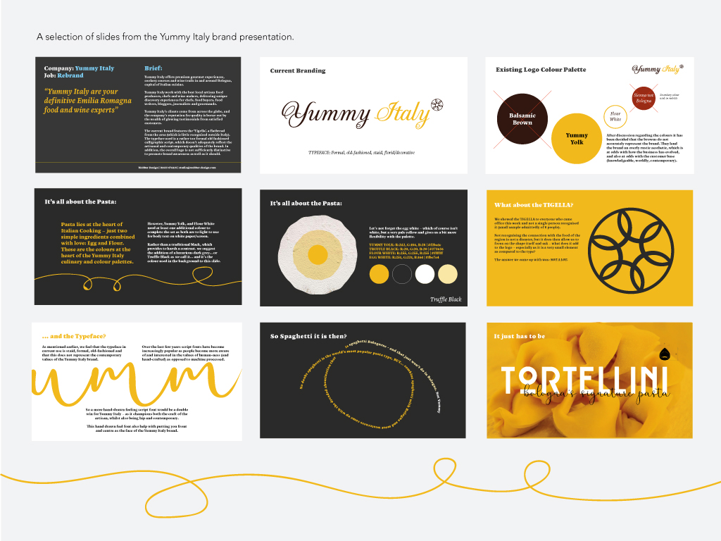
Logo design isn't just about throwing a scattergun of visual ideas at the client and asking them to choose. Over time we've developed our own method of presenting a new logo design to clients by designing slideshows which allow the client to follow our creative process from beginning to end. In Yummy Italy's case, when we submitted our branding presentation, Helena (Yummy's founder) published it to a private Facebook page and invited a wide range of chefs, industry professionals, artisan producers and clients and the response was overwhelmingly great.
Below: A selection of slides from the brand presentation. Click the image below to view the presentation.


Once the branding design process was finished, we ended up with two versions of the logo: one to use on dark backgrounds, and one on light. Additionally we created a variation which sat on a circle, for increased flexibility of layering the logo on top of other visual content.
A Yummy New Website
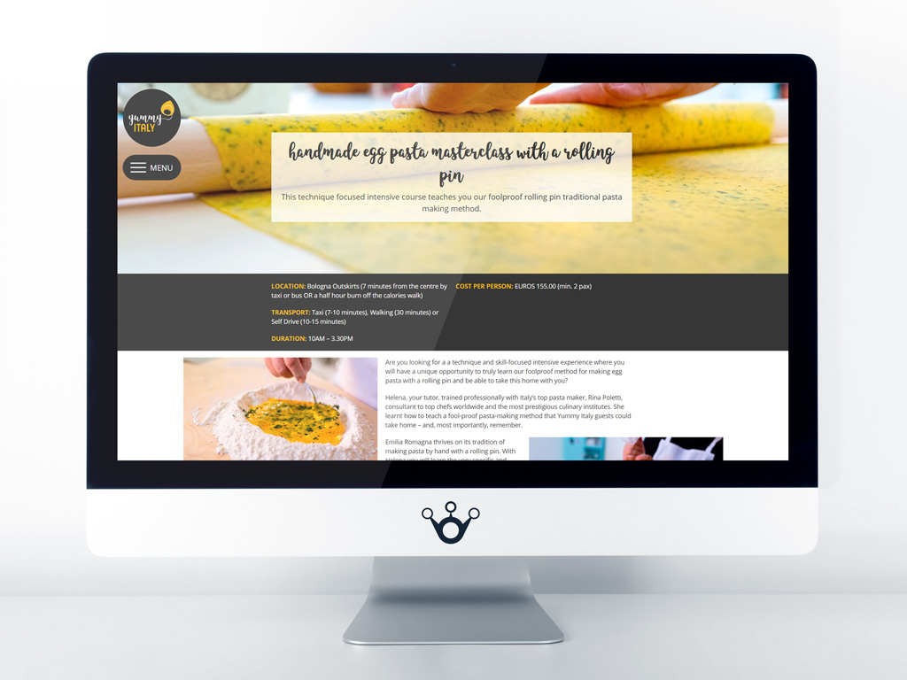
Webber Design designed and built the previous Yummy Italy website, about 8 years ago, and it was time for a change. Over the lifespan of the previous site web technology moved forward dramatically, with the biggest change being the rise of browsing on smartphones. A key component of the brief then was for us to deliver a great browsing experience on PC/Laptop, on tablet computers and on smartphones.
Helena from Yummy hooked up with a great local photographer for a pasta making shoot which resulted in some great new photography for the site. We combined the photography with lots of white space to let the content breathe easy.

The Benefits of Bespoke
We could have downloaded a free copy of he ubiquitous WordPress content management system, then found a free "that'll do" template that someone else has already designed, then pick a load of free off-the-shelf modules to handle the functionality… but that's not the way we do things at Webber Design:
- Each job starts with a blank sheet of paper. We don't use one-size-fits-all templates.
- Each design is bespoke, and only commenced following extensive client and industry sector research.
- Each module is also bespoke. We find out what the client needs and build it, rather than trying to fudge an off-the-peg solution.


Nudging the client to act
With all of our web designs, we try to get into the mind of the potential site user, which helps us to direct them through the site, and nudge them into taking action.
Putting ourselves in the mind of a user, we ask ourselves the following questions, and design the homepage to answer them one-by-one:
- "Am I in the right place?": Maybe a friend has mentioned Yummy Italy, or you've seen an Insta post. We ensure that the web design places the logo top left of the page as the first thing seen to answer that question, along with a short overview of the company.. Also, we ensure that there is consistency of colour, shape, font etc throughout all marketing to aid recognition.
- "Do they offer what I want?": We need to ensure that the user can really quickly and intuitively find the essential 'Our Services/What We Do' section. In Yummy Italy's case we have a simple and clear main menu (phone style), plus cards of the key offerings of the company.
- "Why should I choose this company?": Once the first two questions are answered, the client then needs enough reassurance about the qualities of the company to take the next step. This is where we put our client testimonials and client lists - answering the user's question without them having to go searching for it. Hopefully after answering these three questions then the user is primed to be nudged into taking action, with a CTA (Call To Action). This could be "Call us now", "Sign Up to Newsletter", "Buy Now" etc. In the case of Yummy, we want to drive users to start a conversation with the company, as so much of their services are tailored to the individual clients.

