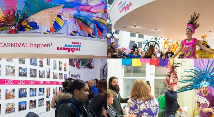
As seen in our last blog post (SWICA Carnival 25th Anniversary Case Study Part 1), we designed, cut and applied all the vinyls for the SWICA 25th Anniversary Exhibition. Aside from being a long-standing client of ours, SWICA are important to South Wales and always throw a good celebration, whether it’s their festivals/parades or an […]
lettering
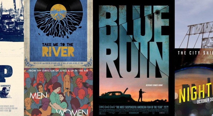
2014 Review: Film Posters
2014’s Top Ten Film Posters (according to us) So here we have it — All the major films due out this year have been released (besides the third and final Hobbit, but let’s not talk about that…), and while a vast majority of releases had the usual floating-head collage with boring type — including a […]
Typography: French Letters, Part 3 (Trois) of 3 (Trois)
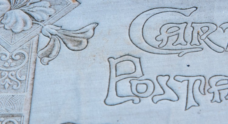
Another fresh Friday French Fonts set (well, typography and signage!). These were taken on a separate trip to the previous two, but still in France and still interesting and alluring. Enjoy, and spread the word around if you like them! Hmm, New York or Barcelona type next…? You decide!
Typography: French Letters, Part 2 (Deux) of 3 (Trois)
Get your friday fix of typography with this second set of french letters. I particularly like the dummy text on the flyover (had to be quick to snap that one whilst driving) Enjoy.
Typography: French Letters, Part 1 (Une) of 3 (Trois)
Vive la France et Vive la Difference. I visited France every year with my family on our annual camping holiday and now carry on the tradition with my own family. Whilst officially holiday time, the kids know that they will always have to wait in the car periodically while I dash out to snap some interesting […]

Typography: Lisbon
Last month (April 2014) I had the pleasure of a short work trip to speak at a conference in Lisbon. I last visited about 15 years ago and had forgotten how great the city was – great food, great climate, great buildings, great coffee and most importantly for this blog, great typography. The city is […]