Vive la France et Vive la Difference.
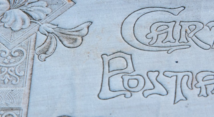
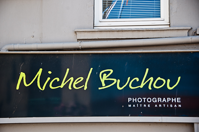
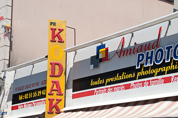
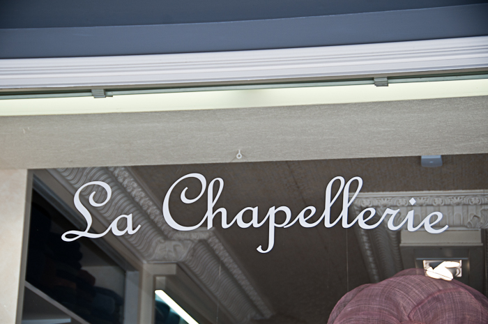
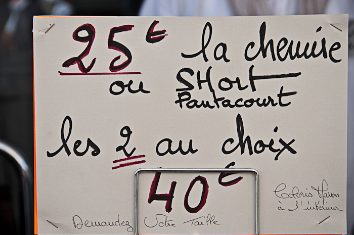
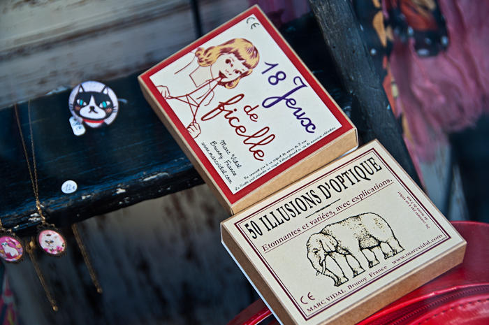
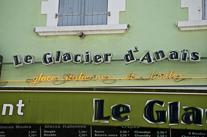
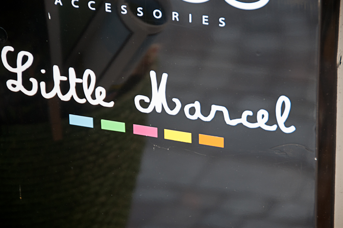
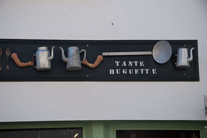
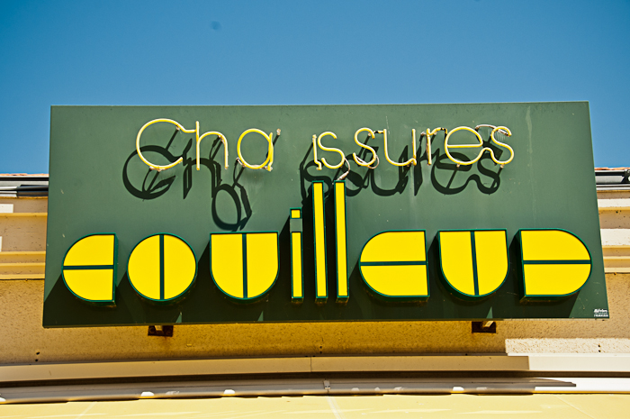
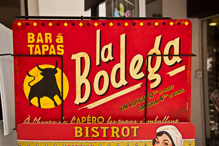
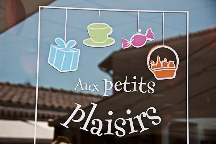
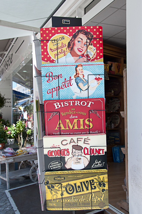
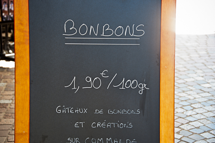
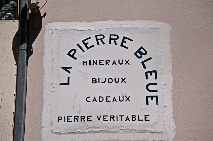
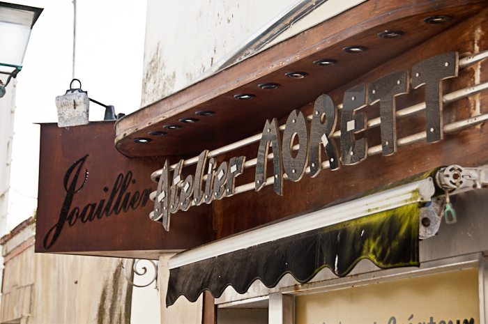
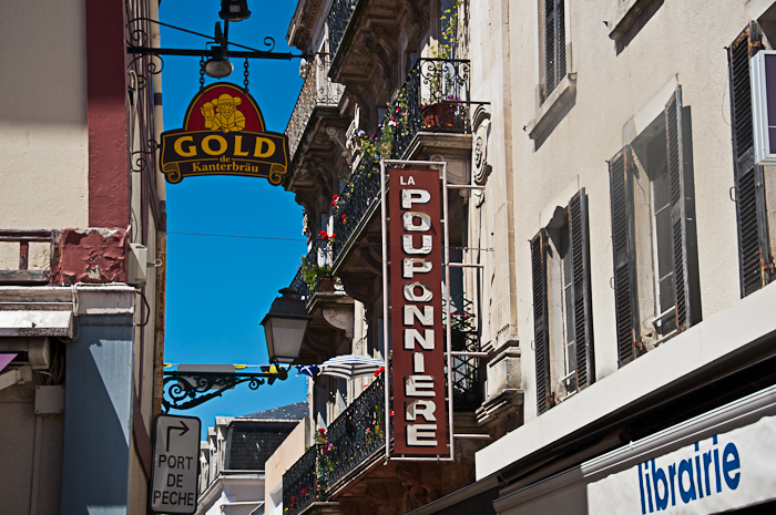
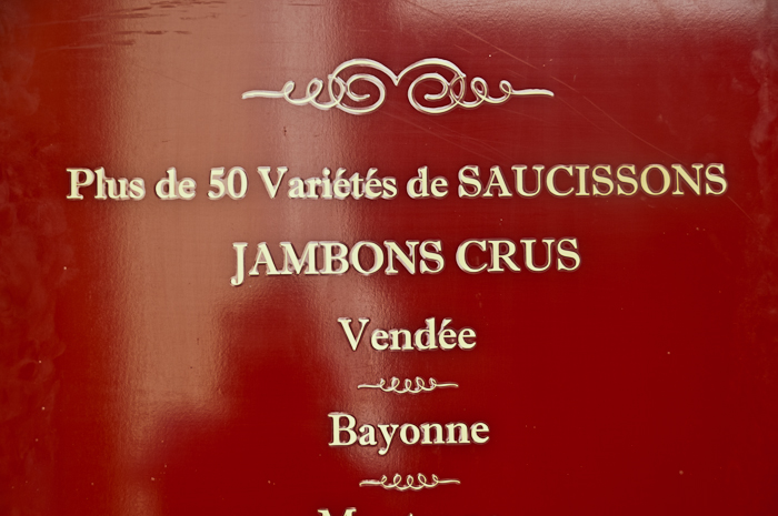
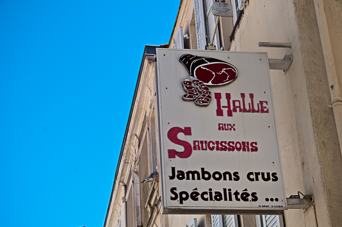
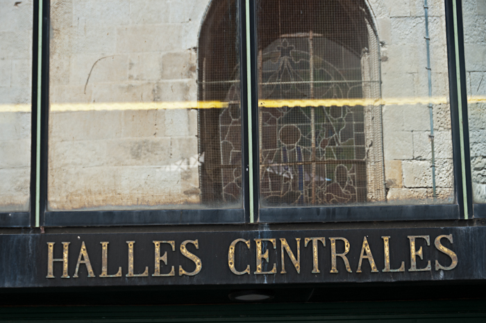
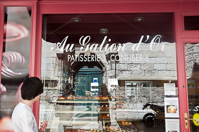
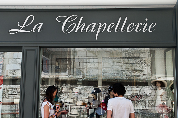
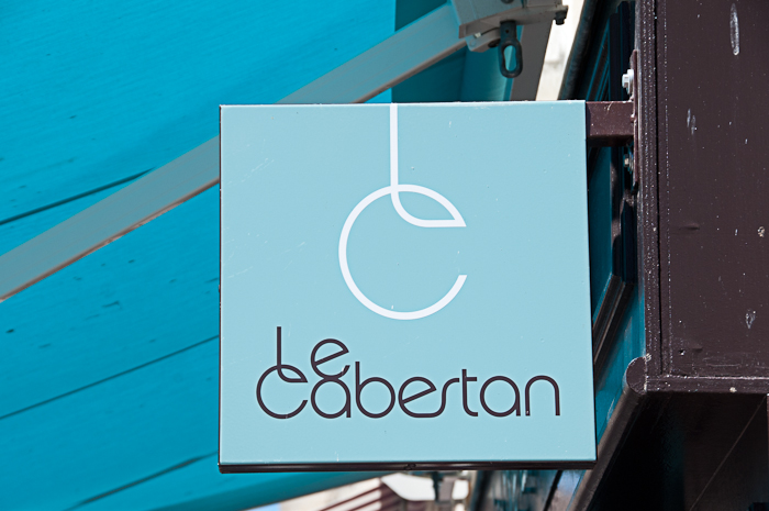
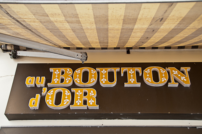
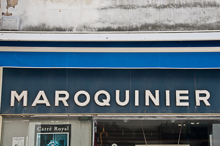
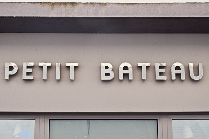
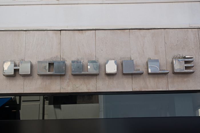
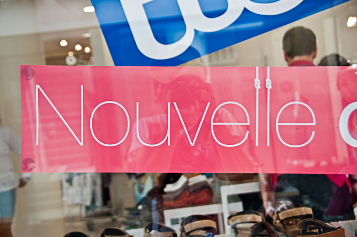
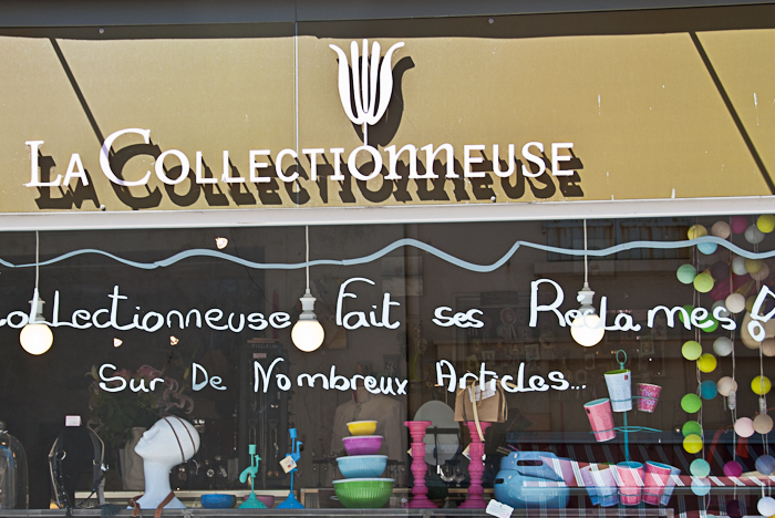
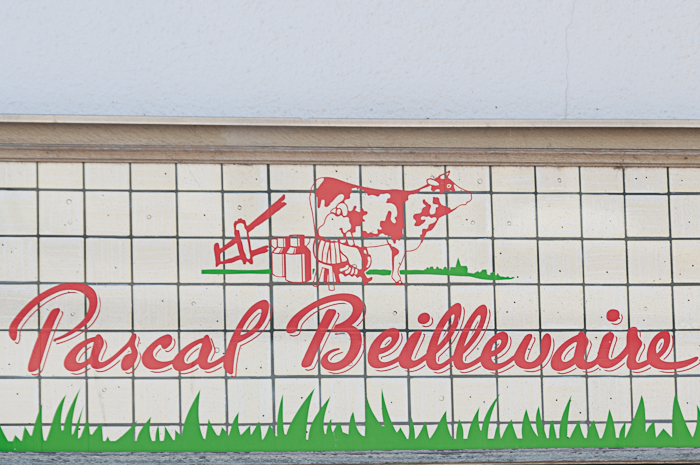
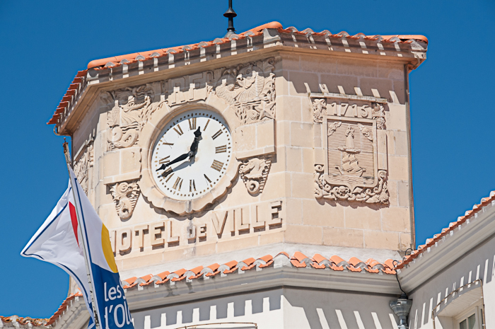
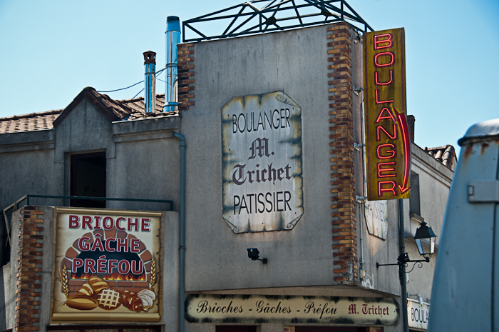
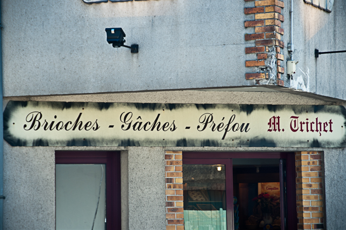
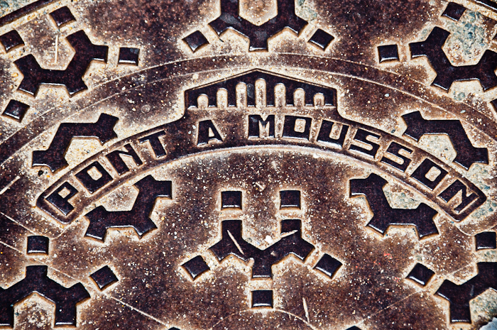
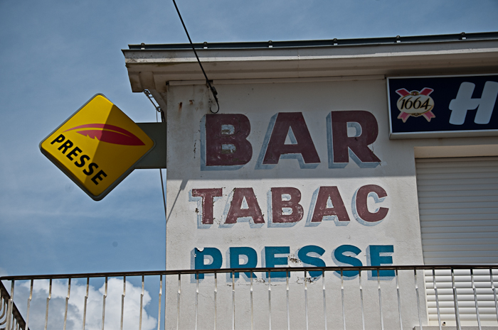
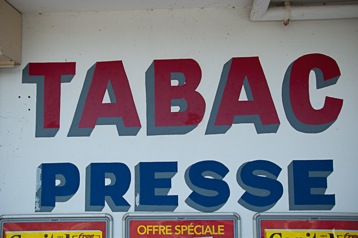
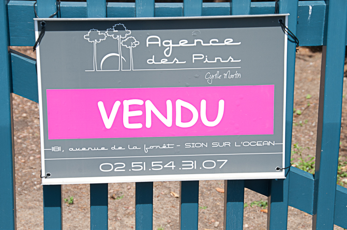
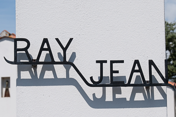
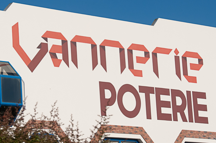
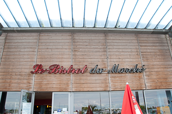
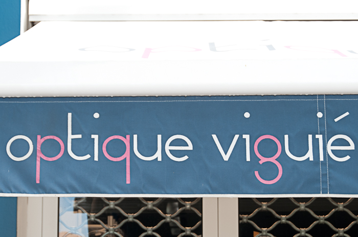
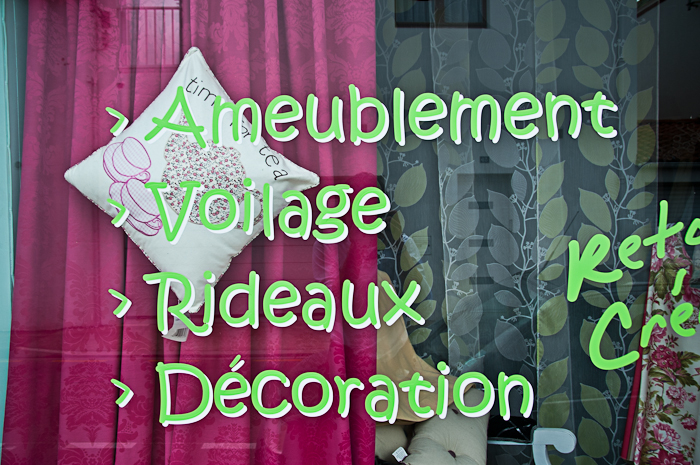
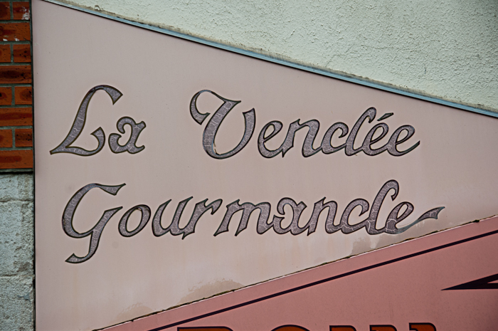
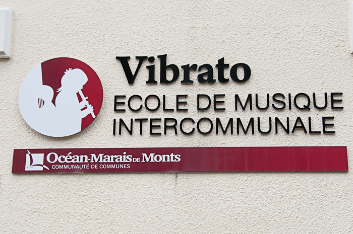
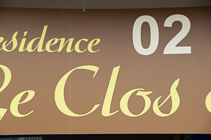
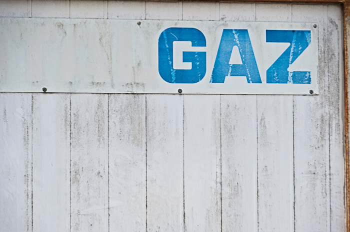
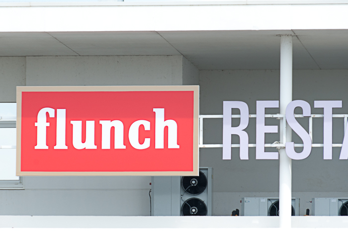
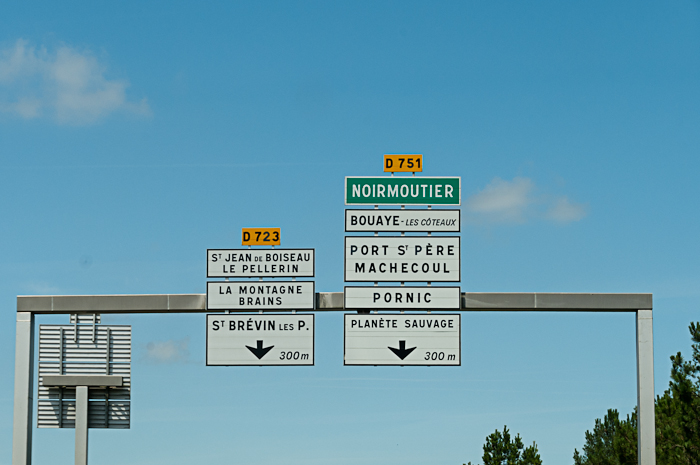
I visited France every year with my family on our annual camping holiday and now carry on the tradition with my own family. Whilst officially holiday time, the kids know that they will always have to wait in the car periodically while I dash out to snap some interesting typography. I try to make sure to take in both the historic and modern examples of typography and signage, to get an all-round flavour of French Letters. This first part is an assortment from 2012’s trip to Poitou Charentes region. A mixed bag of signs, featuring the neon of the middle 20th Century and some remarkably well-kept hand-crafted lettering from the 19th. Much like in the UK, signwriting seems to be a dying art with chain stores taking over the big high-streets, but away from the beaten track you can find a wealth of historical signage, often painted huge on the side of buildings (Dubonnet ads for example).
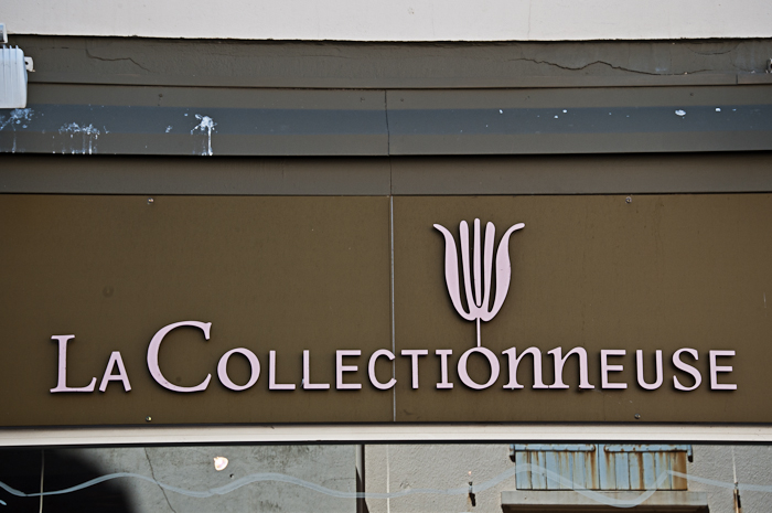
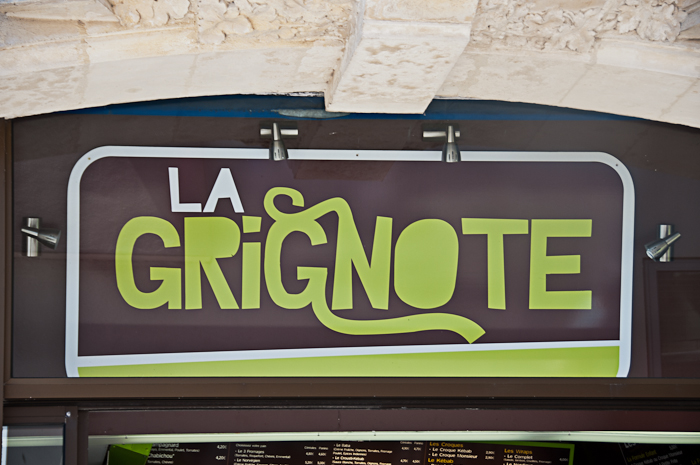
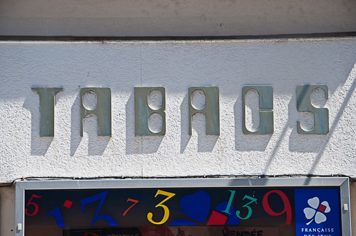
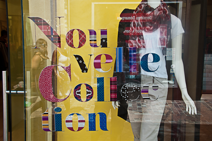
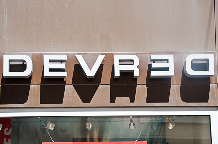
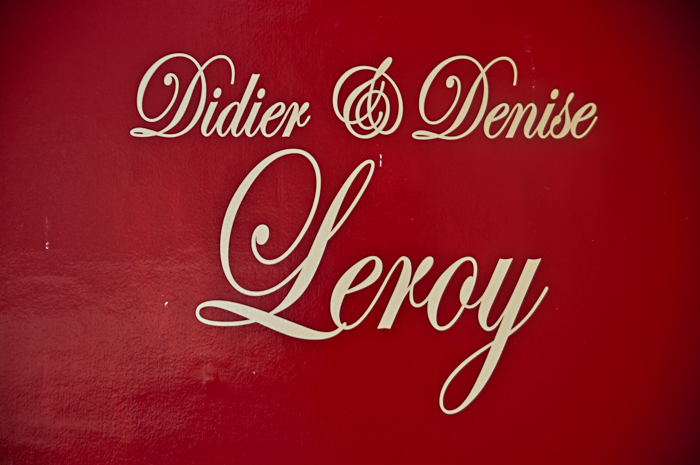
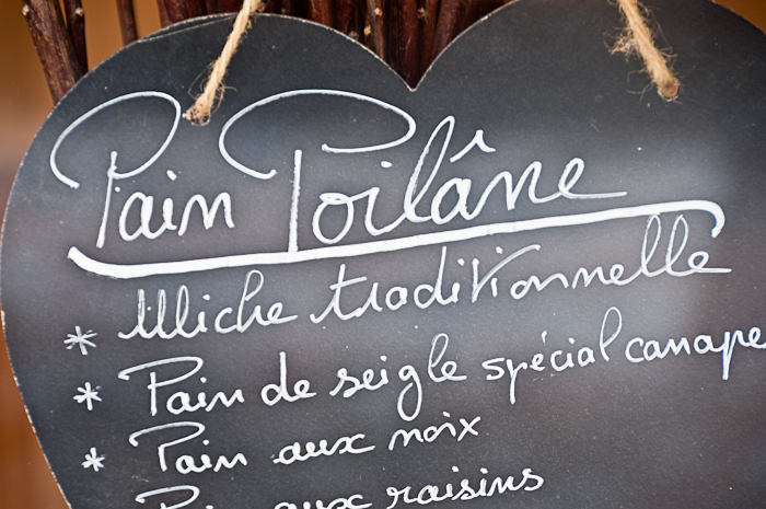
As expected, the French type of old appears to favour decorative but elegant script typefaces, while the more recent designs really trend towards geometric letterforms, with both light and bold examples on show. Of course, there are plenty of degraded, unusual and interesting ones in between…and the omnipresent Comique Sans! On the next visit (summer 2014 to the Basque region) I’m going to try to find a ‘learn handwriting’ book for children, as there is a definite gallic style of curly lettering which you only find there (or maybe also in Quebec?). It is possible that the same hand lettering guy whizzes all over the nation, but he’d have to have even faster transport than Papa Noel.


I’ll be posting PART DEUX next week, and TROIS the following week.