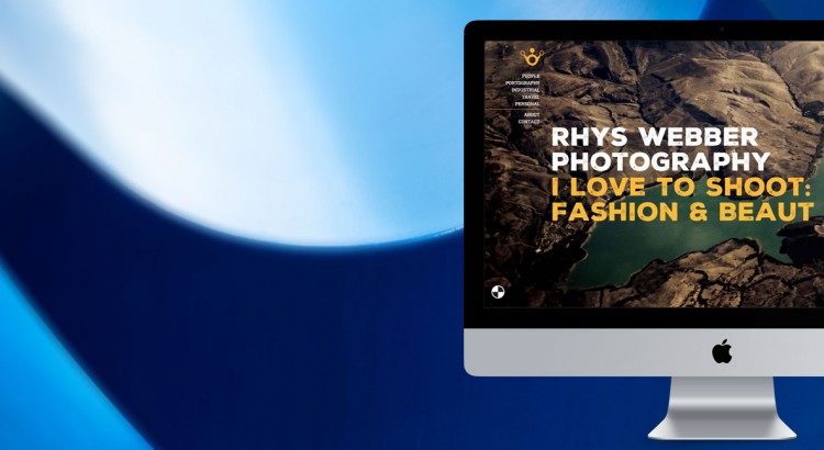
www.webber-photo.com This month we relaunched our sister site: Webber Photo! Webber Design’s MD, Rhys Webber, may be a widely-skilled man with decades of both print and web design skills, but his first love is photography. He shoots all sorts, from people, to landscapes, to abstract. He also offers his services to businesses for corporate photography […]
Typography
Case Study (and Celebration!): SWICA Carnival 25th Anniversary | Part 2
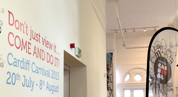
As seen in our last blog post (SWICA Carnival 25th Anniversary Case Study Part 1), we designed, cut and applied all the vinyls for the SWICA 25th Anniversary Exhibition. Aside from being a long-standing client of ours, SWICA are important to South Wales and always throw a good celebration, whether it’s their festivals/parades or an […]
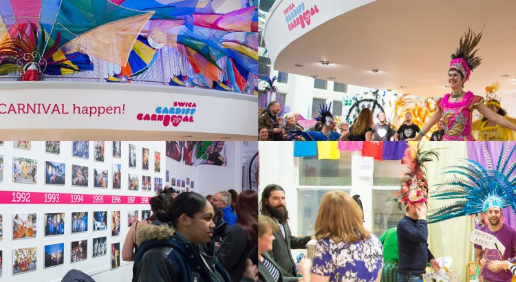
Case Study (and Celebration!): SWICA Carnival 25th Anniversary | Part 1
One of our long-running clients, SWICA Carnival (of Cardiff) celebrated their 25th year of operation this year! Hip-hip, hooray! To mark the occasion, they ran a large exhibition in The Cardiff Story Museum, prompting people to view the history of the carnival and organisation, as well as make their own mark on this year’s festivities […]
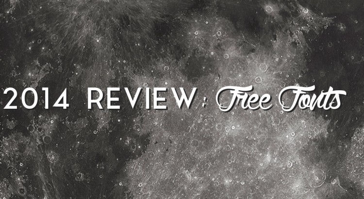
2014 Review: New Free Fonts
There are countless typefaces out there – far too many for most of us to ever use in a lifetime. However, all graphic designers and type heads know – the one with the most when they die wins! So we’ve done a trawl of the best free fonts released in 2014 and selected a few that have caught […]
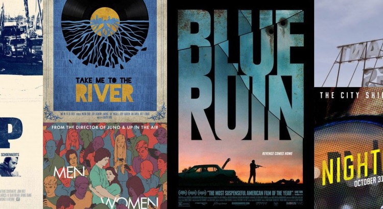
2014 Review: Film Posters
2014’s Top Ten Film Posters (according to us) So here we have it — All the major films due out this year have been released (besides the third and final Hobbit, but let’s not talk about that…), and while a vast majority of releases had the usual floating-head collage with boring type — including a […]
Typography: French Letters, Part 3 (Trois) of 3 (Trois)
Another fresh Friday French Fonts set (well, typography and signage!). These were taken on a separate trip to the previous two, but still in France and still interesting and alluring. Enjoy, and spread the word around if you like them! Hmm, New York or Barcelona type next…? You decide!
Typography: French Letters, Part 2 (Deux) of 3 (Trois)
Get your friday fix of typography with this second set of french letters. I particularly like the dummy text on the flyover (had to be quick to snap that one whilst driving) Enjoy.
Typography: French Letters, Part 1 (Une) of 3 (Trois)
Vive la France et Vive la Difference. I visited France every year with my family on our annual camping holiday and now carry on the tradition with my own family. Whilst officially holiday time, the kids know that they will always have to wait in the car periodically while I dash out to snap some interesting […]

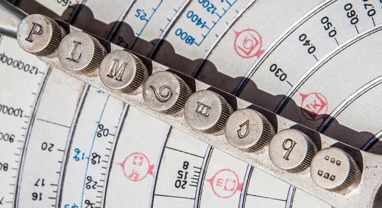
Typography: Malaga
Spending a long weekend in Malaga’s old town was like being a kid in a sweet shop, with what seemed like the whole gamut of typeface history in evidence. From Roman and Moorish faces, right up to the 21st century it’s all there. Most British towns seem so homogenised, so the wealth of diverse typefaces […]

Typography: Bologna. Il buono, il brutto, il cattivo
I was lucky enough to go to Bologna in April to do some work with a client – www.yummy-italy.com (great food and fast car experiences) and managed an afternoon walking around the city centre, camera in hand of course. Bologna is the food capital of Italy, and also the location of the world’s first University, which […]